


iOS app // 2012 // SHIPPED
Shakespeare at Play was conceived to solve the problems that arise when teaching Shakespeare in modern high schools. Shakespeare is challenging to understand — sometimes even for the teacher — because his works are almost always taught from a static text rather than the way they were intended to be experienced: in performance. We wanted to connect performance and text into a single learning experience.
My background is in theatre, and that means A LOT of Shakespeare. I was introduced to Shakespeare in a performance context rather than in a reading context, which helped me tremendously in understanding his work. Nuances in performance can bring depth and meaning that simply don’t appear in static text.
We knew that performances of entire texts would be the central element of our experience, and so what came next was how to present the performances to give students all the tools they’d need to fully tackle his work.
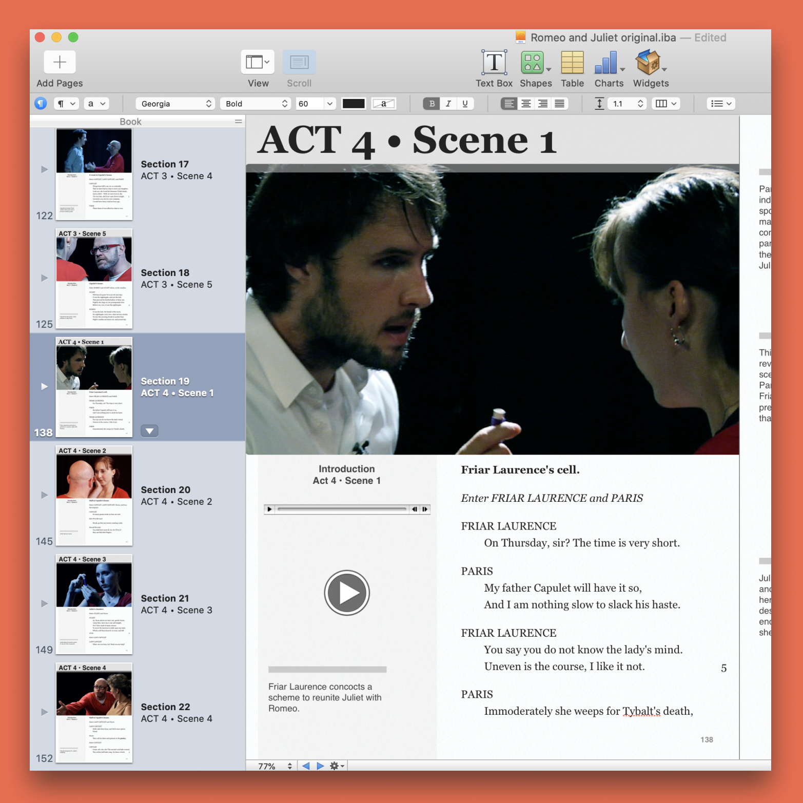
A lot of our early research centered around finding the best ways to present our version of Shakespeare to students to keep them engaged. We worried about the extreme drop-off we might get from users if the videos went on longer than a couple of minutes (a big worry for us considering most of Shakespeare's plays can hit three-hours if done uncut), so to get around that, we broke the plays down into scenes to keep the sessions digestible in length. That decision really helped shape the experience of our app.
Once we knew we were going to break the app up into scenes, we had to decide what materials would accompany the video to aid in student comprehension. I wanted explanations of the scene that gave the video just enough context for the user to follow along. Noam Lior, my partner on the project and a digital Shakespeare PhD, countered that we’d need to have the full play text, contending that if we ignored the text then we were just creating an accessory for a textbook, since a student would always need the text to participate in class. It became kind of obvious once he said it that we’d have full texts in our app as well.
Our initial assumption was that this app would appeal to students as a modern-day CliffsNotes version of Shakespeare; something that they’d seek out to make their homework easier.
However, before we could talk to students we needed to show their teachers what we were working on. Teachers were the gatekeepers to the students. When we pitched what we were working on to the teachers, though, they proved to be more excited about Shakespeare at Play than their kids.
We learned about how they were being pushed to integrate more digital material into the classroom without being given any administrative support to do so. In the case of Shakespeare, they'd use their off-hours to source clips from YouTube, which ate into their already-limited prep time, so having an app where the video is already tied to the text made them early advocates for our app.
This became a major shift for us, both for the business and the UX. Now the app would now have to be as suitable for teachers as it was for teens. That meant ease-of-use now became our chief UX priority.
Since we knew that we wanted the individual scene to be the atom of the project, it became easier to build out from there to the play and the library, making sure that users we specifically driven to the centre of the experience from the moment they entered the app. We mimicked the look-and-feel of a reading app to borrow a familiar metaphor for teachers, so they could make a 1:1 association between their physical books and our digital editions.
We needed to be able to try lots of different layouts for the scenes so that we could experiment with different complimentary materials to aid in student comprehension. Rather than do this in code, we leveraged iBooks Author to act as a working prototype for our ideas. Being able to put a tool in the hands of our users that fully worked helped us to home in on the most usable layout for how we’d present each scene.
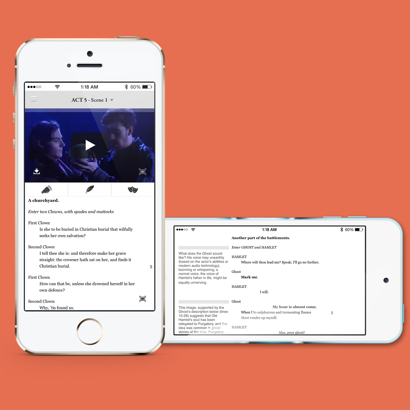
Our initial hypothesis was that the user would interact with our app in two distinct modes: watching and reading. So we initially paginated the scenes, with page one being the video. However, testing quickly showed that users wanted to watch and read simultaneously, and so once a user got to the individual scene we abandoned the book metaphor and presented the content more like a webpage, with the video player on top and scrollable text underneath.
Some teachers, though, wanted the students to be able to contend with the text without the aid of the video. While this violated our belief in how Shakespeare should be learned, we compromised and built the ability to hide the video while making the text of the scene fullscreen.
When we were producing the plays, Noam acted as a dramaturg and would often have tremendously insightful nuggets that would help our actors fully understand the scenes (even classically trained actors need help with their Shakespeare). I found those nuggets so helpful and practical that we added them right alongside the text, and they quickly became our most popular feature.
The iPhone version of our app always felt compromised from two angles: accessibility and discoverability. Because we wanted to preserve the integrity of the line structure, the text font was both very small and non-adjustable, and the Notes were hidden unless the user knew to rotate the phone to reveal them. I don’t know that either decision holds up well today. However, I think the larger misstep was making an iPhone version at all, since it was driven by our belief that we should have one and not that it solving a problem our users had identified. Our iPad version was easily the more popular of the two.